Compound
Overview
Compound is the working title for Phoenix Group’s design system. A design system that aims to support multiple child brands and both web and native platforms.
Compound is the working title for Phoenix Group’s design system which has the long term goal of being the system for all of their digital real estate.
New Challenges
Building Hydrocarbon was a career highlight and I couldn’t have picked a better team for my first Design System role. However, I had reached everything that the product needed and was keen to look for a new challenge to further my skills.`
The position at Phoenix Group was not short of new challenges:
- Supporting multiple brands
- All web applications were required to be fully responsive
- Work on a system that supported web and native platforms
- Work with an off-shore development team
- Support new and legacy applications
- Provide consistency and cohesion to the fragmented product team
My Role
Not only was my role to be the single designer on the design system team, but the only person on the team.
Having come from Hydrocarbon I was able to hit the ground running in getting the project off the ground. My initial tasks involved:
- Completing a component inventory of dozens of applications and platforms
- Consolidating the inventory and North Star vision into an initial UI
- Sourcing and setting up a documentation solution
- Building a Figma component library and supporting the wider teams' learning
- Guiding non-technical managers by agreeing on a technical approach with our off-shore development partners
Off-shore development
A key difference in this role is that the design team development team would not be in-house but our offshore technical partner, TCS.
The development team are not currently in place, it was therefore my responsibility to provide initial plans for the possible architecture and approach that the incoming developers could use as a starting point.
Only once I was in this role, did I take it for granted how key it was to have developers in place at the early stages of the project. Their experience in architecture, technology and building quick prototypes can greatly streamline the initial foundational discussions.
Starting Point
Most design systems start with a component audit but when it came to Phoneix Group’s three child brands. Within each brand there were multiple legacy sites with a long legacy of styles, these are only a sample of the variations.
I took the pragmatic approach to initially tackle one brand, Standard Life, across both the web and native platforms. The learnings for this could then be rolled out into the other brands down the line.
Standard Life was selected as the native application UI was undergoing a revamp. This would become our North Star and the UI would be filtered out across platforms.
Supernova
For many, their initial concept of a design system is to think of a library of UI components. And I believe most designers tackling their first design system would fire up a design tool and start to generate a component library.
In my experience, I have found centralising documentation early to be an even greater asset to teams. Even without any visuals capturing agreed rules on patterns, approaches and standardisations in one place is the first step to alignment, even for self-reference.
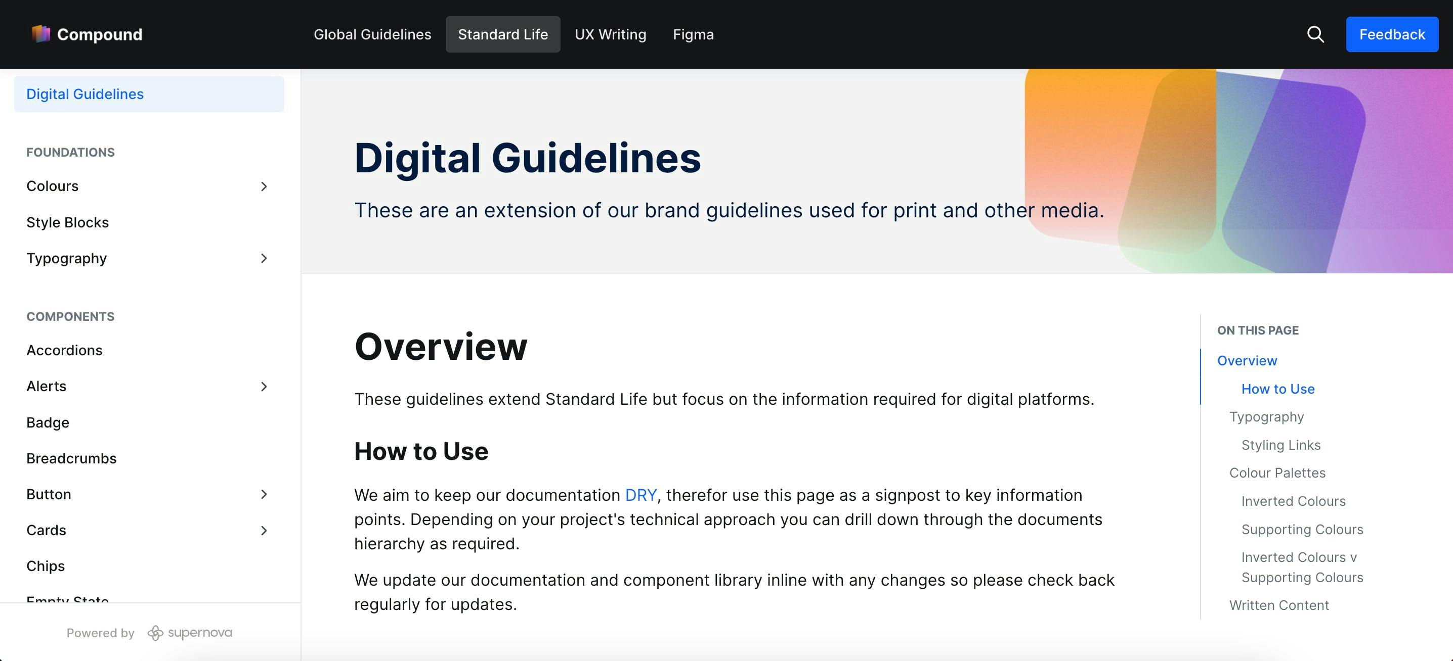
Phoenix Group, unfortunately, did not have any hosting solution and therefore we went for a SAAS solution. After researching a number of options we opted for Supernova, a new but fast-growing system focused on design system documentation.
It has become a key tool within the product team, not only as a location for our UI library but also our UX writing and Figma standards.
Our documentation is publicly available at compound.thephoenixgroup.com.
Rebuilding UI
Bring it Together
The next step was to carry out the audit of the existing website components. With over 200 micro-sites, web apps and sites this was an unrealistic task.
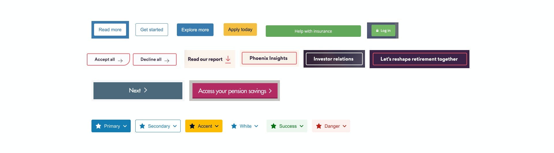
We opted to take the previous UI Sketch library and fill in the gaps from the common design system initially as a list of components but styled using the North Star as a reference point.
UI Workbench
To achieve this I created a file called a “UI Workbench”. Essentially this allowed me to draught the rough components from the component inventory into a file with their own dedicated styles.
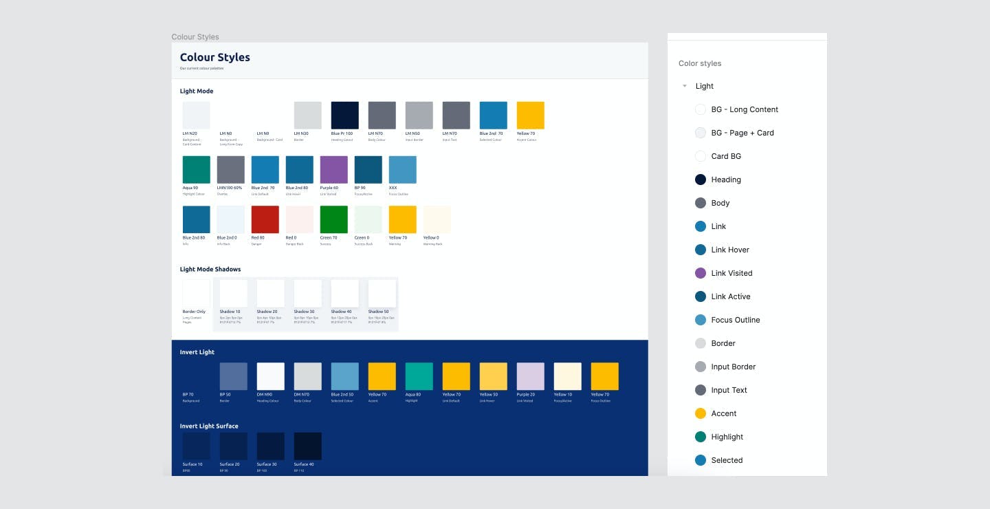
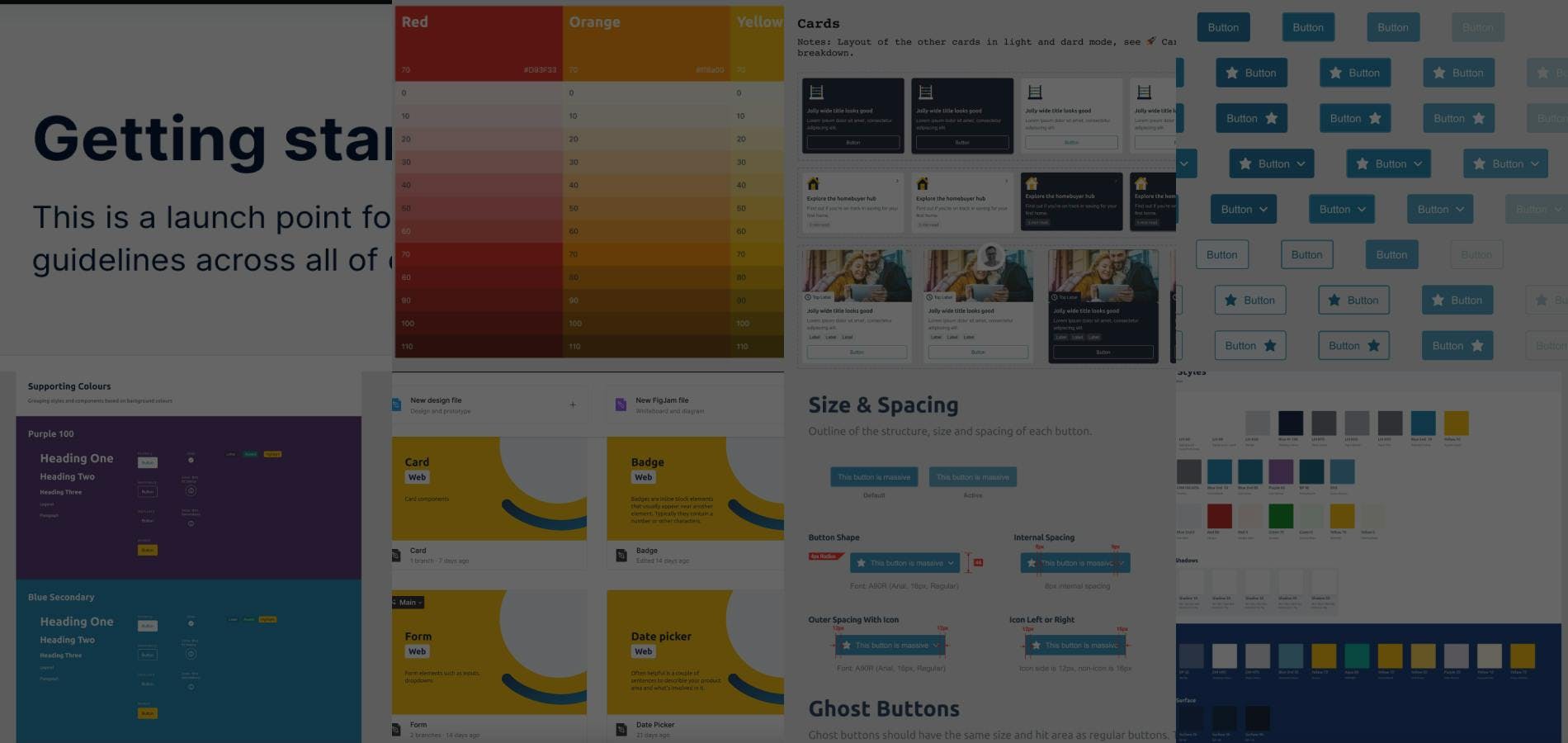
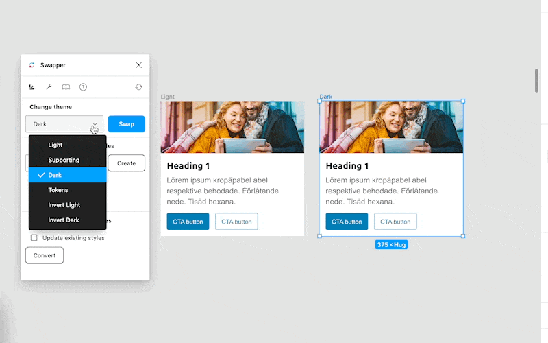
A key part of this process was to building our our initial palettes and design token structure. To speed up the process of trying colours palettes we created style blocks, groups of colours that were accessible and complimentary to a particular surface colour. Setting these colours up as token aliases under a parent theme i.e. light and dark. We were able to quickly mock up a component in the light theme and use the Swapper plugin to quickly swap it to another style. This approach allowed for rapid ideation during this phase of exploration.
Working with a small steering group from the wider designer team, we we able to test and tweak our palette and styles quickly across our component set rapidly. Disconnecting from our production styles made sure there was no disruption to projects in flight too.
This took a number of weeks, however, key decisions were captured in our guidelines as we went. This quickly build up to create our decision framework and gave us a point of reference when we were blocked on any patterns.
Document As You Go
By documenting as we went when we presented our first draught to the team, not only had we created a component library but also the supporting documentation. Coupled with a thorough contribution process we were quickly in a state build out the final library.
Building the Figma Library
This was my fourth Figma component library build out so the steps required was familiar territory for me.
The added twist this time was that we were supporting web and native platforms. The initial approach was to create a component that worked on both platforms. However, we ran into maintenance issues and opted for two separate approaches per platform.
- Web - A separate file per component for more flexibility
- Native - A single file for iOS/Android platforms
Each approach was specifically tailored to how the design team used the components within the platform.
Compound Catchups
Moving to a design system as well as retooling with Figma was a big change for the existing team. To help with the migration I ran a weekly session with the team titled “Compound Catch-up”.
Each week we had a set agenda that covered three topics
- Component Show and Tell
- Figma Clinic
- Documentation Review
- Open Q&A
Having the regular structure allowed the team to get familiar with how components would be created and think about the impact wider than their topic. Overtime, the show and share grew from components I was building out to feedback and suggestions from the team.
Likewise, our Figma clinic was a chance to not only cover the basics but jump into how to effectively use the tool in live projects.
Sessions were recorded and stored for future reference points or onboarding new members.
Next Steps
With the design fundamentals in place the key next steps in the system is to build out the developed components.
Without an in-house technical department, my role in 2023 has providing technical direction on a a longterm approaches to building out a component library.
On the design side, advocation on contribution and using the system within projects are part of my daily role. As the team has scaled and we bring in third-parties or new team members, once again it has been crucial to have a central documentation site.