MyPlay Enhancements
Improving the MyPlay Task
I have included this task from a recent application as it demonstrates how I applied a user-centred design approach to a problem and delivered results in only five hours.
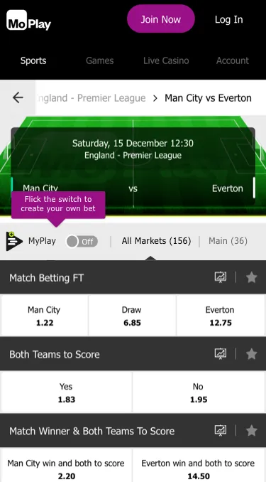
This task was set by MoPlay and based on a real problem they were trying to resolve with their recently launched MyPlay Product.
Click here to see the full final presentation PDF (16MB)
Competitor Analysis
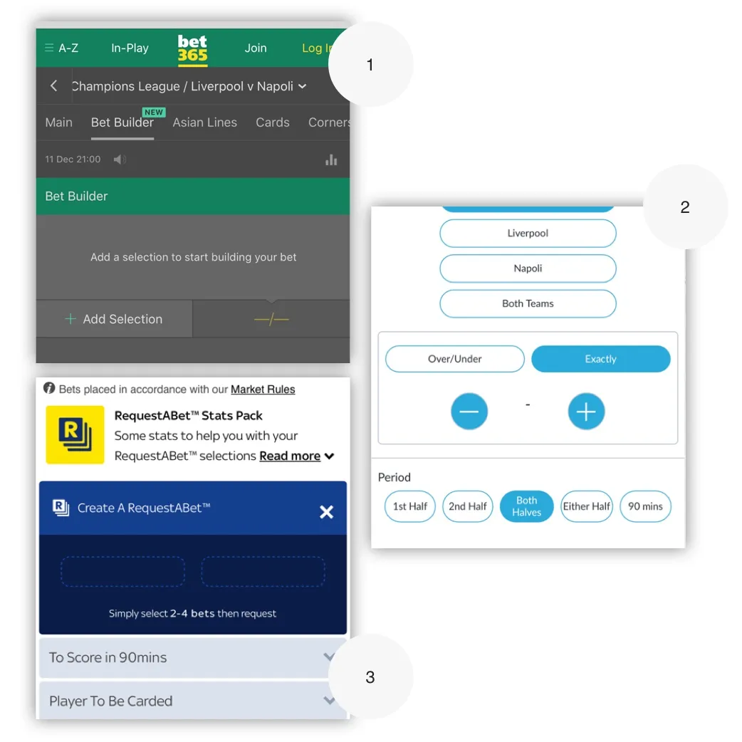
Although I was familiar with this product type from my work at William Hill, this company had their own take on the product which required further investigation.
I began the task with my own review of the product and then switched to reviewing similar offerings from the industries big players.
Left: 1) Bet 365, 2) Bet Victor and 3) SkyBet
User Research
After my own review, I used What Users Do for some quick user research to find if other users familiar with Sports betting had struggled with the same pain points as I had. I asked users to watch the promotion video and complete three short tasks that that stepped them through building a bet.
As I was on a time limit I used my own industry knowledge to create two personas; Young Guns and The Traditionals. MoPlay target market is a young, male football focused market so I assigned four user candidates to that demographic and two to the older demographic.
The reason for targeting the older demographic is that they are on average three-four times more valuable due to a higher disposable income.
I think the trailer should be on the website too
~ User Research Feedback
User Research Results
The user research ran overnight, the next day when I came back to the task I had some key information to work from.
- ALL users struggled to understand the carousel at the final state.
- MOST users would have struggled to understand the product mechanism without the Intro video.
- MOST users struggled with the labelling of the toggle controls.
A key output from this test was that The Traditional customers did not understand this new betting concept. If I had been working on this task as a real project, I would dig deeper into this demographic as they have a higher value.
You can’t bet differently on each market - £5 for one and £2 for other market?
~ A confused Traditional users
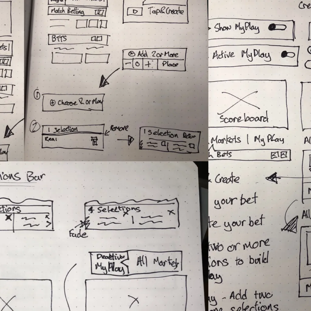
Sketching
With the research output gathered I started my design process with low fidelity sketches. I have found this to be the quickest way to iterate through many design options.
As time was the constraint I opted for some really rough and ready sketches; mainly focusing on labelling and flow to get some ideas down.
These new ideas gave me a baseline to start working on the UI. The screens below show some of the ideas I tried out.
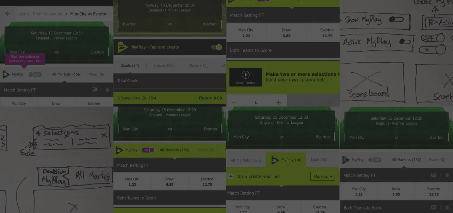
Final Concept
I used Sketch and worked with the existing UI assets which allowed me to quickly iterate a number of ideas. Sketch’s Mirror and Prototype features in allowed me to get a “real feel” for the changes in real time.
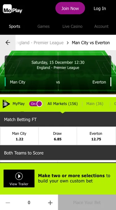
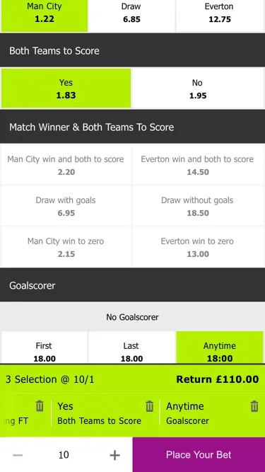
The main changes I made to this product were:
- Make the toggle control clearer when it is active.
- Improve the journey with clearer instructions and easy access to the video.
- Fixed the UI of the carousel to be clearer that it was clearer to scroll horizontally.
What I learned from this task
The time constriction of this task demonstrated me how efficiently I can work but maintain a human-centred design approach.
In such a short a time frame, I was able to move through all the key points of product design from research, ideation and final UI and prototyping to demonstrate a number of solutions to the initial problem.