Compound
Compound
Overview
Compound is Standard Life’s Design system. A design system that aims to support multiple different technical stacks for both web and native platforms.
This has been a large scale project that I have been leading as the sole design system designer since early 2022. It encompasses design tokens, component libraries for HTML/CSS and React Native, documentation and all of the governance and processes that go along with running a design system.
This case study outlines the key challenges and solutions that I have implemented to get Compound off the ground and into the hands of the wider product teams.
New Challenges
Building Hydrocarbon was a career highlight and I couldn’t have picked a better team for my first Design System role. However, I had reached everything that the product needed at the time and was keen to look for a new challenge to further my skills.`
The position at Standard Life was not short of new challenges:
- Supporting multiple platforms (web and native)
- Supporting multiple technical solutions inhouse and via third parties
- Being the sole design system designer on the project
- Work with an off-shore development team and third-party vendors
- Support new and legacy applications
- Provide consistency and cohesion to the fragmented product team
My Role
Not only was my role to be the single designer on the design system team, but the only person on the team.
Having come from Hydrocarbon I was able to hit the ground running in getting the project off the ground.
As a team of one my role encompassed a wide range of activities including:
- Completing a component inventory of dozens of applications and platforms
- Consolidating the inventory and concept vision into an initial UI
- Sourcing and setting up a documentation solution
- Building multiple Figma component library and supporting the wider teams’ learning
- Guiding non-technical managers by agreeing on a technical approach with our off-shore development partners
- Advocating for the design system within the wider product teams
- Creating contribution processes and governance for the design system
- Create design token naming conventions and structure
- Working with development teams to build out the initial components specifications on everything from ways or working to reviewing PRs
In my experience, I have found centralising documentation early to be an even greater asset to teams. Even without any visuals capturing agreed rules on patterns, approaches and standardisations in one place is the first step to alignment
Starting Point
Most design systems start with a component audit but when it came to Phoneix Group’s three child brands. Within each brand there were multiple legacy sites with a long legacy of styles, these are only a sample of the variations.
I took the pragmatic approach to initially tackle one brand, Standard Life, across both the web and native platforms. The learnings for this could then be rolled out into the other brands down the line.
Standard Life was selected as the native application UI was undergoing a revamp. This would become our North Star and the UI would be filtered out across platforms. Luckily, this was the correct brand to select as late in 2025 Phoenix Group announced that Standard Life would be the main brand going forward.
When this project started in early 2022, Phoenix Group owned multiple brands and the design system was built to support all of them. This meant that not only was I building a design system from scratch but also helping to bring together multiple brands and legacy projects.
Supernova
For many, their initial concept of a design system is to think of a library of UI components. And I believe most designers tackling their first design system would fire up a design tool and start to generate a component library.
In my experience, I have found centralising documentation early to be an even greater asset to teams. Even without any visuals capturing agreed rules on patterns, approaches and standardisations in one place is the first step to alignment, even for self-reference.
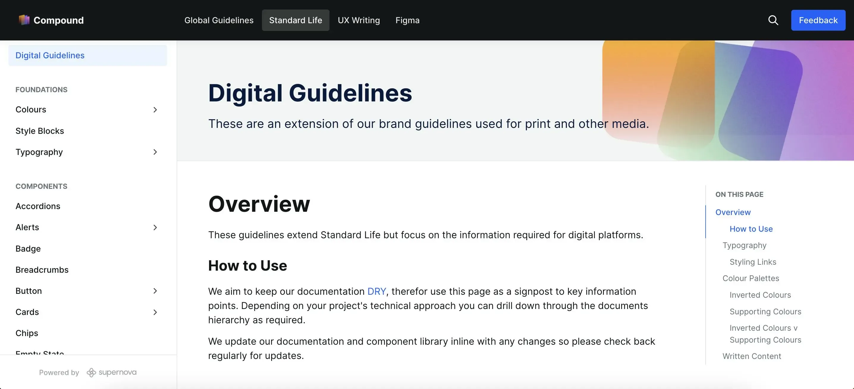
Phoenix Group, unfortunately, did not have any hosting solution and therefore we went for a SAAS solution. After researching a number of options we opted for Supernova, a new but fast-growing system focused on design system documentation.
It has become a key tool within the product team, not only as a location for our UI library but also our UX writing and Figma standards.
Our documentation is publicly available at compound.thephoenixgroup.com and we use Supernova to host our documentation and much more.
Rebuilding UI
Bring it Together
The next step was to carry out the audit of the existing website components. With over 200 micro-sites, web apps and sites this was an unrealistic task.
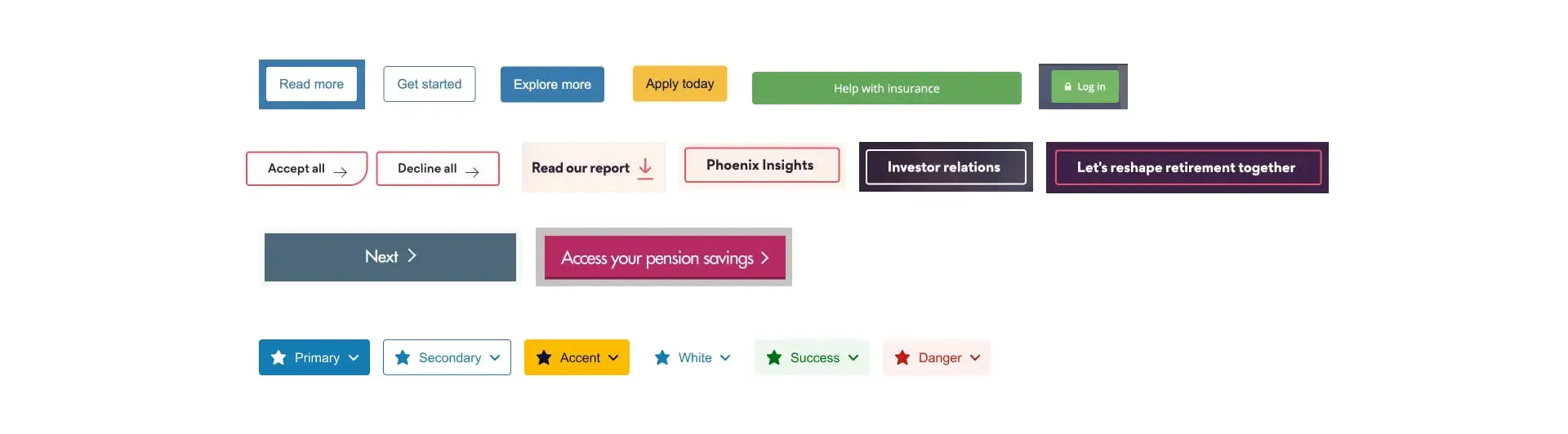
We opted to take the previous UI Sketch library and fill in the gaps from the common design system initially as a list of components but styled using the North Star as a reference point.
UI Workbench
To achieve this I created a file called a “UI Workbench”. Essentially this allowed me to draught the rough components from the component inventory into a file with their own dedicated styles.
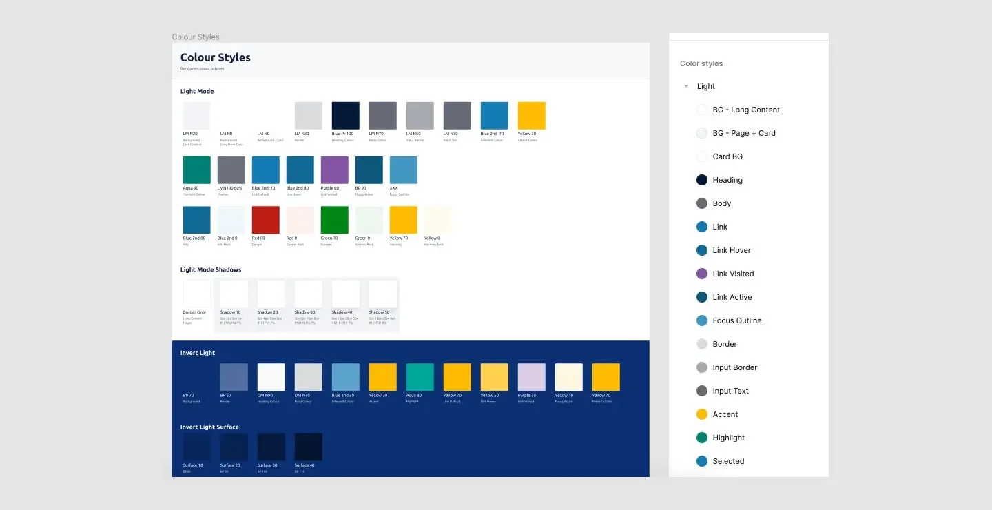
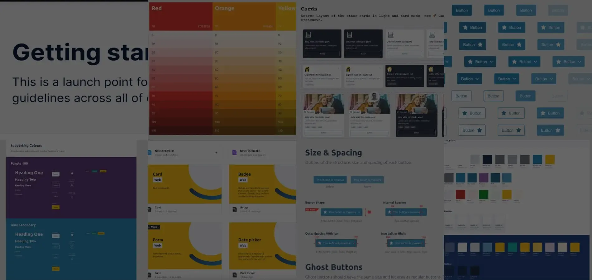
A key part of this process was to building our our initial palettes and design token structure. To speed up the process of trying colours palettes we created style blocks, groups of colours that were accessible and complimentary to a particular surface colour. Setting these colours up as token aliases under a parent theme i.e. light and dark. We were able to quickly mock up a component in the light theme and use the Swapper plugin to quickly swap it to another style. This approach allowed for rapid ideation during this phase of exploration.
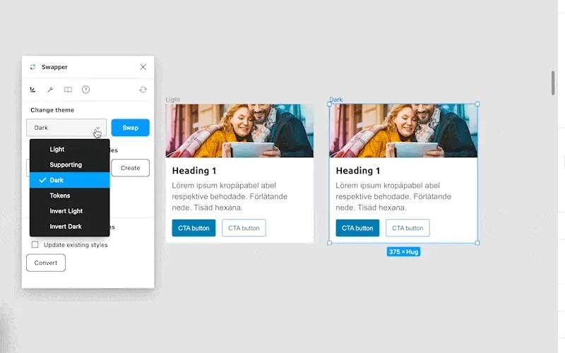
Working with a small steering group from the wider designer team, we we able to test and tweak our palette and styles quickly across our component set rapidly. Disconnecting from our production styles made sure there was no disruption to projects in flight too.
This took a number of weeks, however, key decisions were captured in our guidelines as we went. This quickly build up to create our decision framework and gave us a point of reference when we were blocked on any patterns.
Document As You Go
By documenting as we went when we presented our first draught to the team, not only had we created a component library but also the supporting documentation. Coupled with a thorough contribution process we were quickly in a state build out the final library.
Building the Figma Library
This was my fourth Figma component library build out so the steps required was familiar territory for me. Over the duration of this system I’ve built and maintained multiple Figma libraries for different platforms including web, iOS and Android.
Design Tokens
Design tokens became the backbone of Compound. With multiple platforms, technical stacks, and brands to support, hard-coded values were never going to scale.
After research and testing I defined a token structure that was semantic, platform-agnostic, and future-proof. Rather than exposing raw values, tokens were organised around intent — colour, spacing, typography, motion — allowing teams to build consistently while retaining flexibility at the implementation layer.
This approach meant that theming, brand changes, and accessibility improvements could be made centrally and cascade through products without costly refactors. It also gave non-design stakeholders a clearer mental model of how the system worked, helping align design and engineering around a shared source of truth.
Supporting multiple platforms and technical stacks meant that tokens needed to be platform-agnostic. I worked closely with our development partners to define a naming convention and structure that could be easily mapped to different platforms, whether web CSS variables, React Native styles, or design tool styles. Supernova’s token management and export features were invaluable here, allowing us to maintain a single source of truth while generating platform-specific outputs.
Accessibility
Standard Life has a strong commitment to accessibility, so ensuring Compound met WCAG 2.1 AA standards was non-negotiable. This meant designing components with sufficient colour contrast, keyboard navigability, and screen reader compatibility from the outset across all platforms.
Coming from a web background this was familiar territory for me, however, ensuring parity across native platforms presented new challenges. This is an area I am continually learning about as native platforms have their own accessibility features and constraints.
AI Compatibility
At the time of writing this case study in late 2025, design systems are becoming the backbone of AI tools for design and development. One of my ongoing focuses for Compound is ensuring that our design tokens and component definitions are structured in a way that can be easily consumed by AI tools.
Supernova’s API and token export features are already proving useful here, allowing us to experiment with AI-assisted code generation and design suggestions that align with our system.
Learning how to write guidelines not just for humans but also for AI tools is an emerging area that I am excited to explore further.
Multiple Platforms
One of Compound’s defining challenges — and strengths — was its need to support both web and native platforms across multiple technical solutions, including in-house builds and third-party vendors.
Rather than forcing a single implementation model, Compound focused on shared principles, patterns, and tokens, allowing platform-specific components to be built in ways that respected their underlying technologies. This reduced friction with engineering teams and made adoption far more realistic.
Clear documentation around best practices and platform-specific considerations helped teams understand how to implement what was possible on their project.
Centralising our design tokens allowed us to maintain consistency across platforms while accommodating their unique capabilities and constraints.
Ongoing Work
This design system has multiple pivots alongside progression in our tooling, the massive shift in AI tools and the internal approach to our technical stack.
Each day I continue to learn a lot about design systems and product development. I share my experience online and in various Design System communities to both give back and learn from others.
Perhaps most importantly, Compound established a shared language and decision-making framework across Standard Life’s product teams. What started as a fragmented ecosystem of legacy styles and platforms now has a clear direction, scalable foundations, and a system that can grow alongside the organisation.
As a team of one, this role pushed me to operate across strategy, execution, advocacy, and governance — and reinforced that successful design systems are as much about people and process as they are about components.